Sunburst Botanics
Exploring a more human
identity for medicinal cannabis
Sunburst Botanics is a self-initiated brand concept exploring how medicinal cannabis could be presented with greater warmth, trust and approachability.
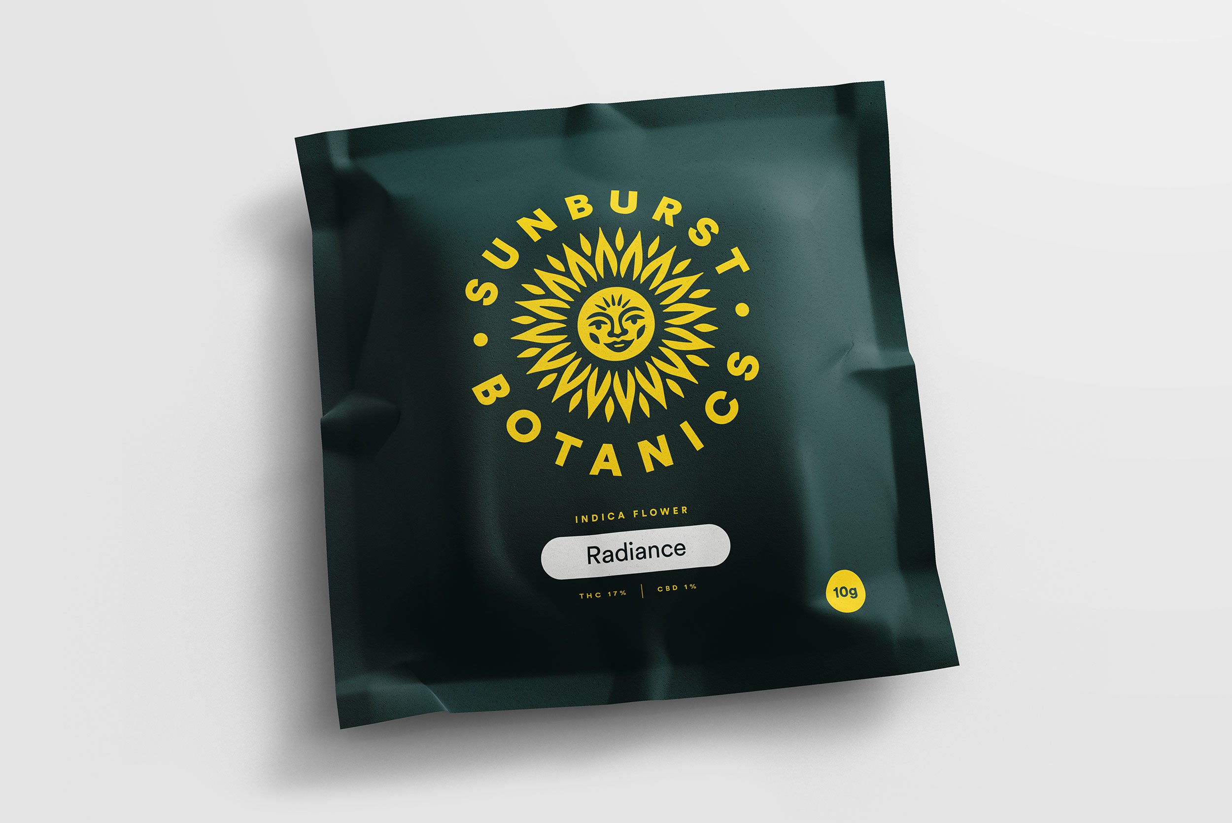
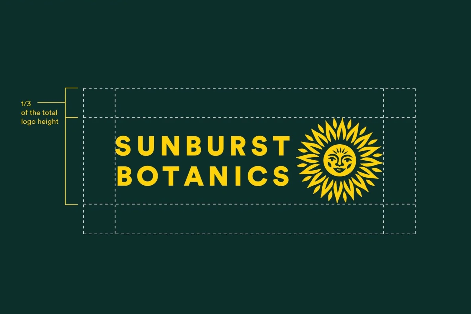
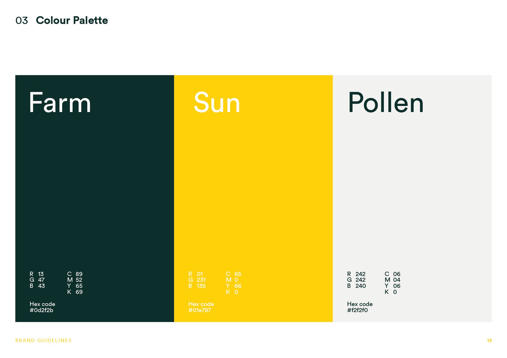
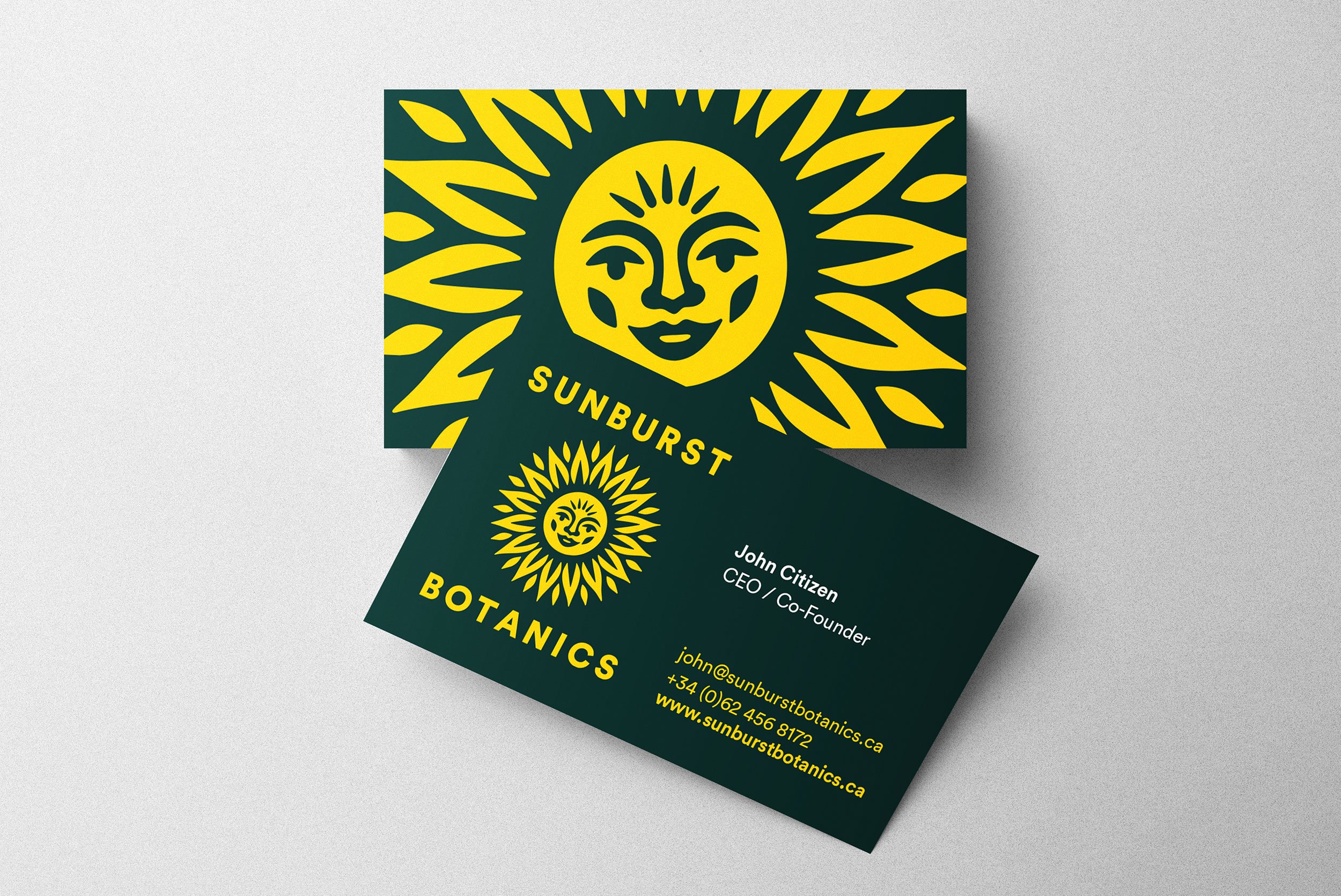
Rather than relying on the visual conventions often associated with cannabis, I wanted to create an identity centred on natural wellbeing. The sun became the defining symbol – representing warmth, optimism and renewal – supported by a simple palette inspired by sunlight, plants and the natural environment.

Built around the sun
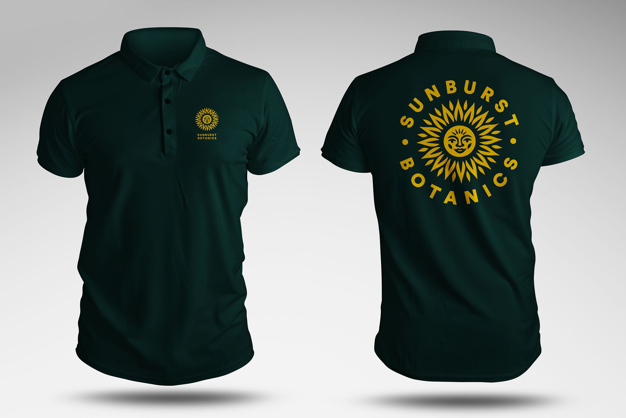
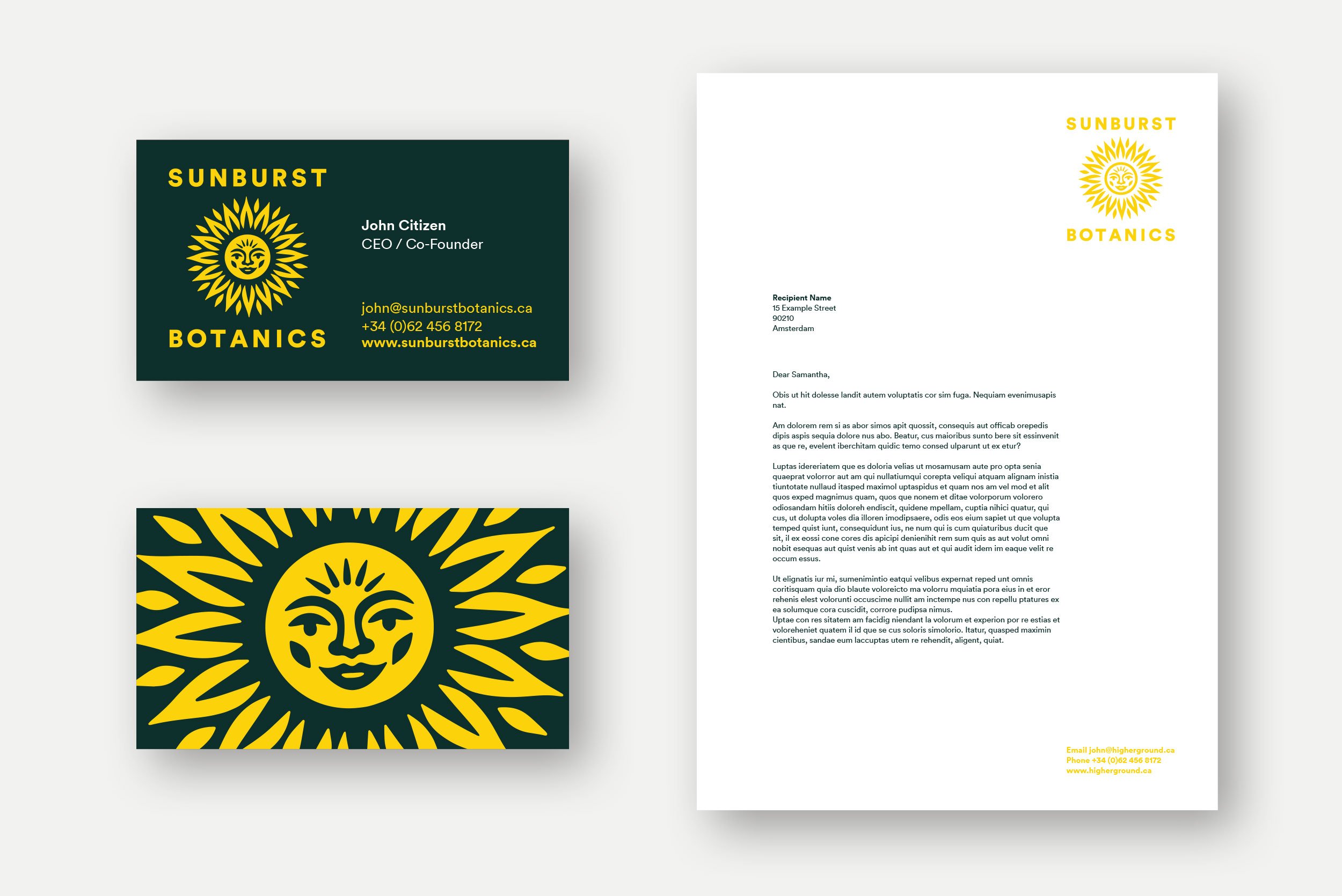
The identity was designed as a flexible system, allowing the sunburst to move between a distinctive brand mark, graphic device and pattern. A deep botanical green provides a grounded foundation, while the bright yellow brings warmth and energy to packaging, apparel and communications.

A brand symbol
that radiates

AWARD WINNING
AWARD WINNING

Selected for LogoLounge
The Sunburst Botanics identity was selected for inclusion in LogoLounge Book 15, chosen by a panel of industry judges from more than 30,000 submissions worldwide.
Following the selection of Harvest Laneway for Book 14, it was particularly rewarding to have another identity recognised in the following edition.

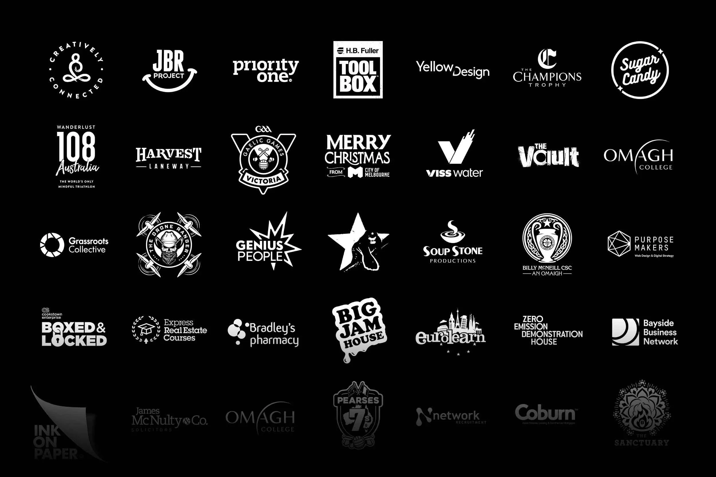
Other Identity Projects